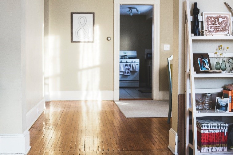
Soft neutrals like gray or cloud white are flexible enough to work in every room. Generally, a neutral backdrop can be accessorized with color much easier than the opposite. It’s good to know that each room can receive its own special combination of color. The key to a coherent look is to choose an anchor color that is continuous throughout the home.
When searching for a palette, look to history for some cues. Old magazines are a great source of inspiration because they can show which colors have stood the test of time. The fads are easy to spot because they’re here today and gone tomorrow. Unless you’re planning to paint every few years, a classic neutral combination might be a good choice. Here are some classic combinations and room where you might find them.
Pale pink and white are a sophisticated and sincere pair. The combination has the passion of red with the honesty of white to produce a hue that is both feminine and powerful. An ultra-pale pink ceiling can warm a north room without feeling oppressive. Combine light pink walls with white tile and bathroom fixtures for a truly warm, blush-worthy space of your own.
Analogous greens in cool combinations work together to make a space feel at once decorated and timeless. Yellowish green walls with glass green cupboards has a healthy, Eco-vibe that is calming and ageless. When the combination is grounded by white counters and appliances, the room becomes fresh and balanced.
Beach tones are a perennial favorite for minimalist interiors reminiscent of seaside vacations and first apartments. White-on-white with blue accessories is the easiest color combination for beginners. Mix and match woodsy beiges, natural greens, strong maritime blues and oyster whites for variety. If you actually live near the sea, add some fun accents such as marine-themed prints and artwork.
Big accent colors such as goldenrod and forest green are perfect for adding a bit of drama to small spaces. Gold is one of the most elegant colors and looks luxurious in a formal dining room. Dark greens work wonders in small rooms and vanity bathrooms, especially when combined with white wainscoting. Fantastic colors such as grape, extravagant teals, and metallics work well for hidden rooms and closets where they will surprise with their suddenness.
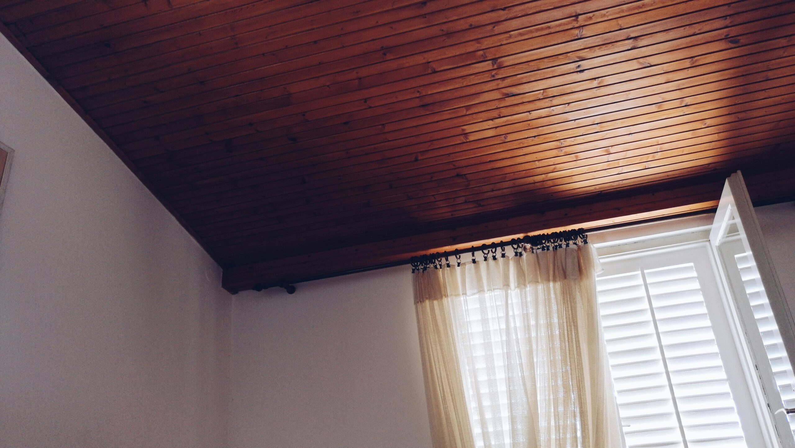
Grey and honey wood tones are inspired by an era of simple refinement. This combination is a good example of the warm-cool aesthetic popular with high design in the 30s and 40s. Its restful stillness invites one to pause and collect. The rich golden hues of the wood reflect warm light in contrast to the absorbent grey tones. It’s a great combination for showing off architecture because it doesn’t compete with anything, including itself.
Most major paint manufacturers have produced apps that allow you to ‘try on’ a paint color by taking a picture of your room. Take several pictures during the day as the temperature of the light changes. They don’t replace painting a sample on the wall, but they are fun to use and a source of inspiration.
Questions or comments? Want to talk about your next real estate transaction? Contact us today.
![]()